
Tuesday, June 7, 2016
Wednesday, June 1, 2016


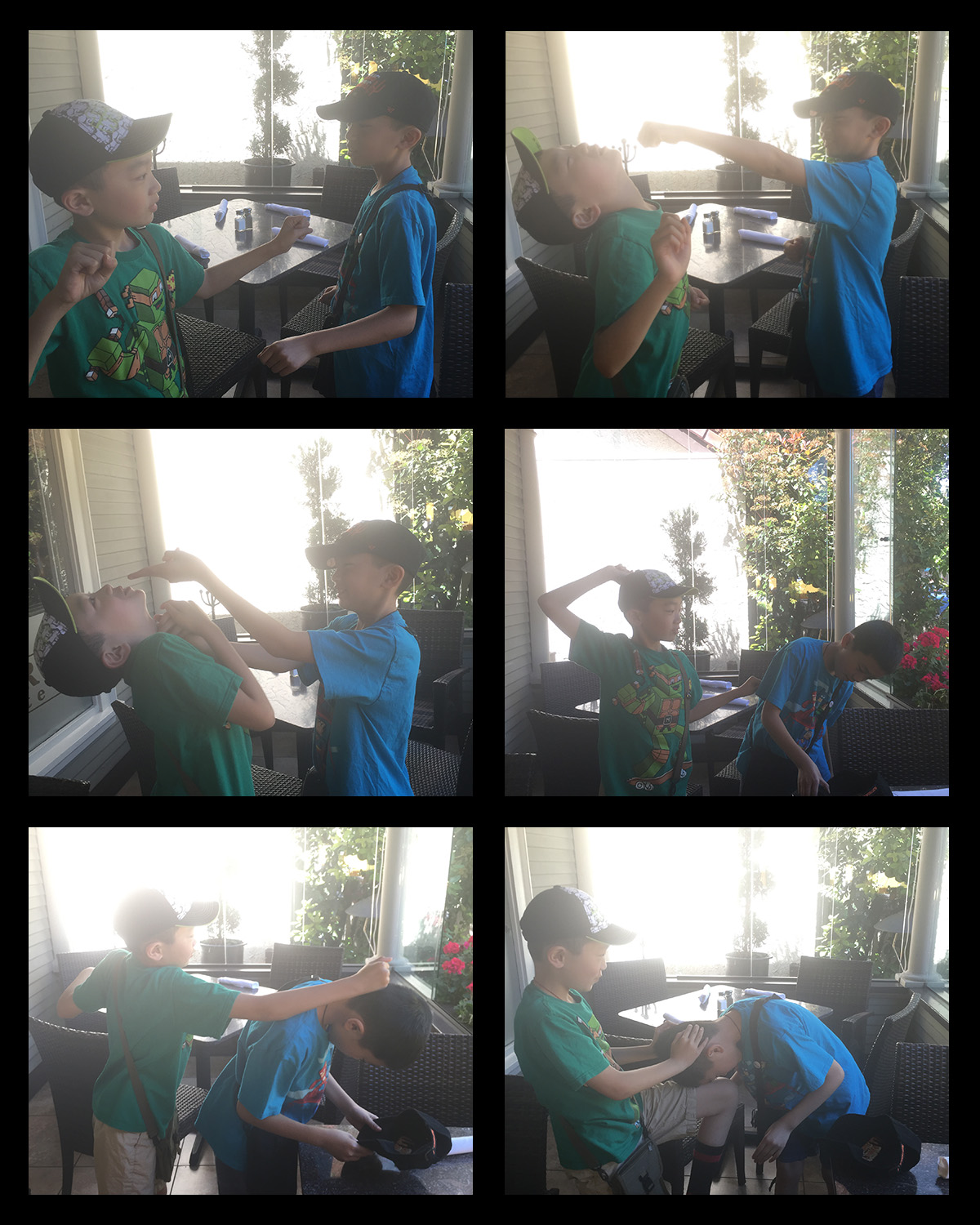
Thursday, May 19, 2016
Forced Perspective


- The shot that looks most believable is the one of me grabbing the floor, it looks almost like I'm falling
- The most interesting shot is the one of me licking the tree.
- It was difficult coming up with ideas and finding the right angle for the shots.

Wednesday, May 11, 2016


Monday, May 9, 2016
Still Life
Still Life

Black & White

Camera Phone

- The still life represents simplicity.
- The lighting in the image is direct.
- The background could have been better set up in the pictures.
Tuesday, May 3, 2016
Continuing Action

- My favorite part of the image is how it all looks like it's one picture.
- The most difficult part of this process was trying to keep the shadows of the subject but not make one part too dark.
- The easiest part of this process was getting the pictures all aligned.
Monday, April 25, 2016
Water Motion


Station 1
- Yes because the shutter speed was fast enough to get the shot.
- I liked how good the lighting was with the flash.
Station 2
- Yes because we had plenty of time to take pictures since the food coloring kept moving.
- I liked how many pictures we could take at once.
Station 3
- No because the burst mode wasn't fast enough so the shots came out blurry.
- I didn't like how the burst mode wasn't fast enough to take the pictures.
Station 4
- No because the lighting wasn't very good so the pictures were too dark.
- I liked how easy it was to take the pictures.
Thursday, April 21, 2016
Motion Image

I believe my photo looks pretty realistic. I made different sections of the car more or less blurry so it doesn't look so cut and paste.
Thursday, March 31, 2016
Green Screen Project


- I found that getting the lighting right was the most difficult part of the project.
- I like how natural she looks in the picture, like it's candid.
- I could have planned what I wanted to do out better.
Thursday, March 17, 2016

Thursday, March 10, 2016
Surreal Photo

- The tool I used the most was the brush tool.
- The best part of my composition is how it looks like her dress is part of the water.
- It was difficult combining the two images because it was hard to make it look like her dress is growing out of the creek and not just look like a picture on top of her dress.
- I could have tried harder to make it look like the water is part of her dress instead of making it look so see-through.
Wednesday, March 2, 2016
Surreal Landscape

- I learned more about clipping masks, how to place images, and how to warp images.
- I ended up with 30 layers not including the background layer.
- I enjoyed this project because I like all the different steps since I enjoy using photoshop, and because I like the finished product.
Monday, February 29, 2016
Speed Challenge Quiz
Ted Talk
- There are a lot of beautiful color in his shots.
- All of his pictures show beautiful shots of nature.
- His images have an amazing message about conservation, about saving the environment and animals.

- I like how the color of the sky gets darker at the top of the picture.
- This shot us amazing because of the colors and the clear horizon line.
- We used the iPhone 6 filter "Transfer".
- This was a challenge for us because it's really hard to get good shots on the Cal High campus.
- Color and balance were used in this image.
Wednesday, February 17, 2016
Abstract Images


- My favorite image is the one of the feather because you can see each strand of it.
- The image that shows the best use of the elements of art would have to be the stone surrounded by moss.
- The image of the feather has elements of repetition, pattern, and rhythm.
- My favorite image and filter combination are the ones of the stone surrounded by moss, the filter makes if look like the image is made out of glass.
Friday, February 12, 2016
Landscape


My favorite picture is the first one, where you can see through the branches of the tree.
- I tried to use the rule of thirds, I used the sky of emphasis.
- I used several principles of design in this picture, you can see the texture of the branches and the color of the sky. There's balance between the branches and the houses/trees and you can see the pattern of one tree after another.
- I shot this picture in the late morning, around 9:00 or 9:30am. I would have liked to have shot either earlier or later at night, I feel that the photo might have been more interesting at these times.
- I used the branches as the foreground and the houses as the background, which was a little different since the foreground was on top and the background was on the bottom.
Edge Burn

Channel Mixer

Lab Color Method

Gradient Map

Desaturation

- The method that produced the best result for me was the channel mixer method.
- I achieved a rather big value range with each image, the best one was the channel mixer one since you can see more white.
Monday, February 8, 2016
Macro Lens


- I really enjoyed using the macro lens to get a super zoomed in shot.
- My favorite shot would have to be the one of the moss because it's so focused and it looks like a perfect circle.
- The picture of the dried up flowers probably shows the best use of the rule of thirds.
Wednesday, January 20, 2016

Tuesday, January 12, 2016

Monday, January 4, 2016

Subscribe to:
Comments (Atom)